Color in outfits: how to combine colors in clothing
This is part of the guide How to Put Together Outfits — a closer look at the first group of principles: working with color.
The color wheel
How it works. The color wheel is one of the most structured and visual ways to understand why some colors feel harmonious together while others create strong contrast. In styling it's used less as a set of strict rules and more as a map of how colors relate.
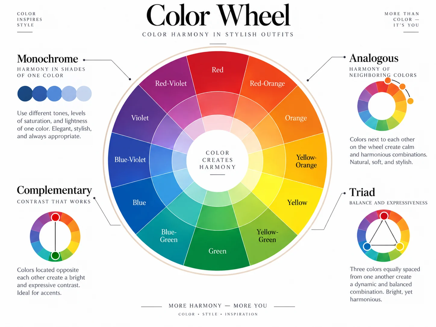
The main schemes:
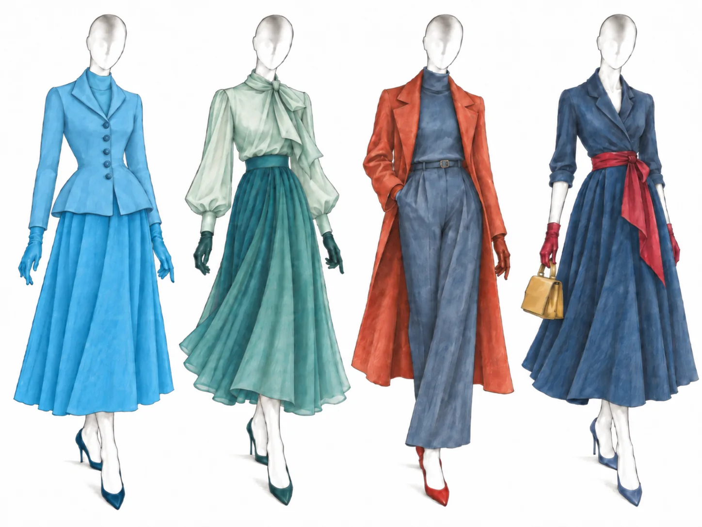
- Monochrome — one color in different values and saturations: pale blue, mid blue, deep blue. The shades can vary, but they never cross into a neighboring color on the wheel.
- Analogous combines neighbors on the wheel — blue and blue-green, say, or green and yellow-green. The transition is soft, with no strong contrast.
- Complementary colors sit opposite each other: blue and orange, red and green, purple and yellow. These pairs give the most noticeable contrast.
- Triadic uses three colors spaced roughly evenly around the wheel. The classic example is red, yellow, and blue. It's a more advanced scheme that lets you bring several independent colors into one outfit.
Where it comes from. Color-wheel theory long predates modern styling. Its history goes back to Isaac Newton's experiments with the spectrum, and color theory was later developed by Johannes Itten and others. No single author "brought" the color wheel into fashion — it gradually became part of the basic language for working with color in clothes.
Who it's for. The color wheel is especially useful if you want to move beyond neutrals and choose colors more deliberately. For beginners it's a handy reference: instead of guessing whether two shades "go together," you can see how they sit on the wheel and what scheme they form.
Different schemes do different jobs. Monochrome pulls an outfit together and can visually lengthen the silhouette. Analogous colors give a soft pairing with no sharp contrast. Complementary colors make an outfit bolder and more energetic. Triadic lets you use several colors while keeping a clear relationship between them.
Strengths and limits. The color wheel works with any wardrobe and gives you a clear framework for combining colors. But it mainly shows relationships between hues — on its own it won't tell you how well specific shades will actually work. Value, saturation, and temperature matter too.
So two colors can fit your chosen scheme perfectly and still look too harsh or too heavy in specific shades. This is clearest in complementary and triadic combinations: pure, saturated colors create a much bolder effect than their muted versions.
In practice. You can calm a complementary pair without changing the scheme — swap bright blue and pure orange for dusty blue and terracotta, for instance.
In monochrome, add different textures: wool, denim, leather, and silk help separate close shades and keep one color from looking flat.
In a triad, it's usually easier to pick one lead color and use the other two in smaller doses — in shoes, a bag, a print, or an outer layer.
If you want the simplest starting point, try a neutral base plus one color accent. That's the next principle, but it shows the same idea: a color doesn't have to take up half the outfit to change it noticeably.
How to try it in GetWardrobe. Start by filtering or sorting your items by color — the easiest way to see your wardrobe's palette: which color groups you already have and which shades show up most. Then pick one item as a starting point and, based on its color, decide which scheme to build: monochrome, analogous, a complementary pair, or a triad. Use the color filter when creating an outfit to find items in the color you need and test the scheme against your own wardrobe.
The three-color rule
The color wheel helps you decide which shades can work together; the three-color rule helps you decide how many of them to keep in one outfit — and which one leads.
How it works. The rule suggests limiting an outfit to three main colors and giving each a role: one leads, the second supports it, the third works as an accent. For example, navy trousers, a white shirt, and a red bag.
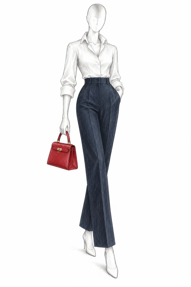
The point isn't the magic number three — it's cutting visual noise. When several bright colors compete in one outfit, a limited palette helps pull it together.
Where it comes from. The rule has no single confirmed author; it exists in many versions across styling advice. It's best treated as a popular practical heuristic, not a classic rule with one source.
Who it's for. People whose outfits often feel busy, and anyone building a compact or capsule wardrobe. A limited palette makes items easier to combine and helps you quickly see which color leads and which ones support it.
Strengths and limits. The rule is simple, memorable, and gives a clear starting point. But counting literally breaks down fast: different versions count neutrals differently, and a multicolor print is hard to reduce to "three colors" at all.
So the rule is more useful as a way to simplify a busy outfit than as a ban on a fourth color. In maximalism, heavy layering, or print-driven looks it may not apply — and that's fine.
In practice. Look at the whole outfit, including shoes, bag, and accessories. If there's a multicolor print, treat it as one complex element and echo one or two of its shades elsewhere.
If an outfit feels busy, try removing a color or making it less prominent. Another simple move: keep one dominant color, use the second in smaller amounts, and the third only as an accent.
If colors don't quite come together, check their temperature — several warm or several cool shades often read more cohesively than a random mix of the two.
How to try it in GetWardrobe. Build an outfit and look at its palette as a whole — the app lets you see it clearly without trying anything on. Assess the clothing, shoes, and accessories separately.
Neutral base + accent
If the three-color rule limits the palette, neutral base + accent is the simplest way to assign roles to colors. The outfit is built on neutrals — white, gray, beige, black, or navy — while one more expressive color becomes the accent.
That can be a small detail, like a red bag with gray trousers and a white shirt, or a large piece, like a green coat with jeans and a cream sweater. The accent doesn't have to be bright; what matters is that it stands out against the rest of the palette.
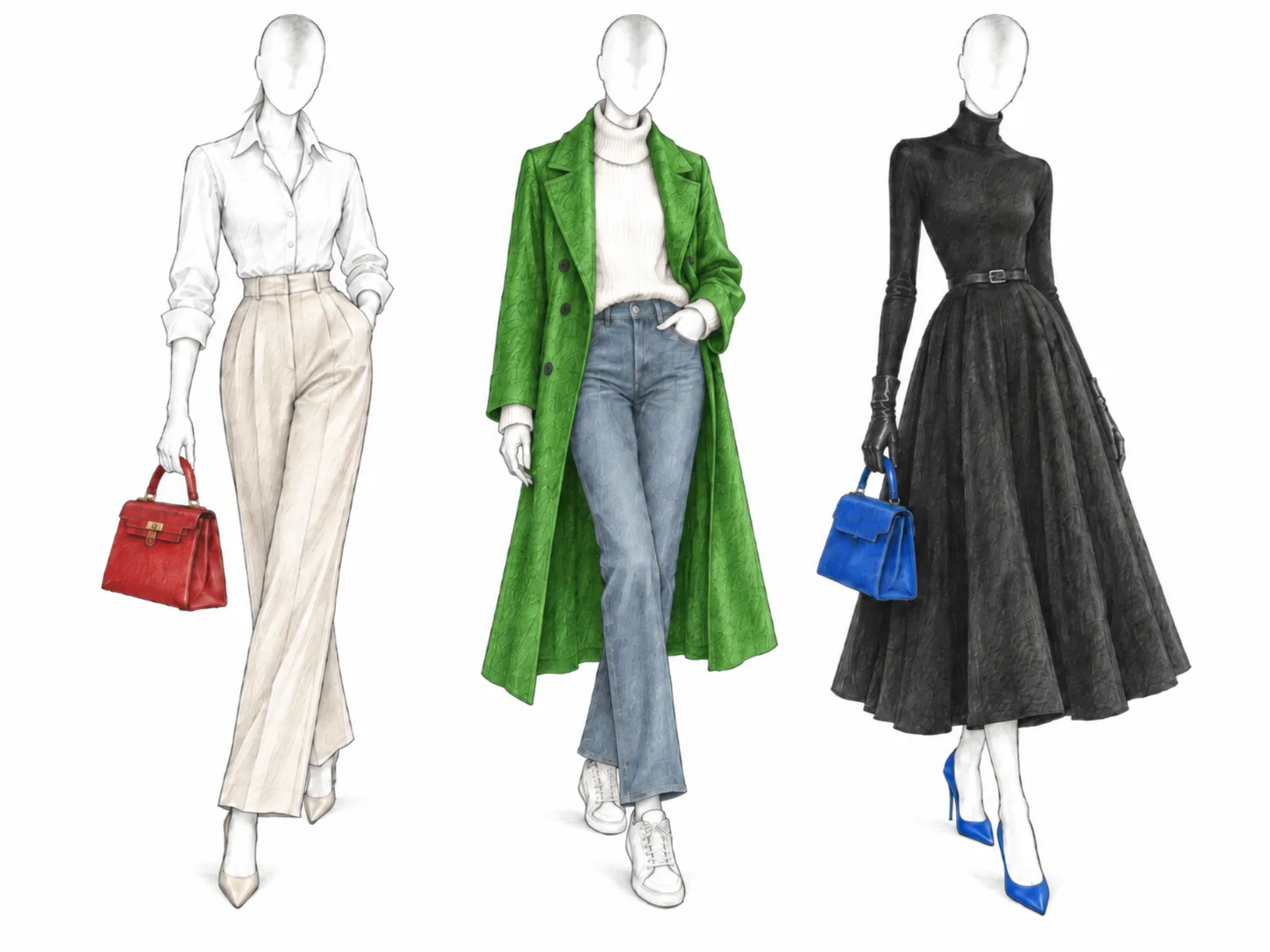
Who it's for. One of the simplest schemes for a small or capsule wardrobe. Neutral pieces are easier to combine, and you can change the character of an outfit with a single accent color — in shoes, a bag, outerwear, or accessories.
Strengths and limits. The scheme makes pieces much easier to combine and lets you shift the feel of the same base with small details. But used literally in every outfit, a wardrobe can start to feel predictable. A neutral base is a handy tool, not a requirement for combining colors well.
In practice. A related principle is 60–30–10, borrowed from interior design: roughly 60% of the outfit is the main color, 30% supporting, 10% accent. You don't need to calculate the percentages literally. The point is the uneven split: one color dominates, a second plays a smaller role, a third appears in small touches.
The ratio isn't rigid either. Sometimes 80/20, two small accents, or a print instead of one of the color blocks works better. What matters is a clear hierarchy of colors, not an exact ratio.
Personal contrast
How it works. Sometimes individual shades suit you, yet a combination still looks too harsh or, the other way around, too washed out. One styling approach is to consider personal contrast — how much your skin, hair, eyes, and brows differ in lightness.
For example, pure white with black is far higher-contrast than gray-blue with dusty pink. With lower personal contrast, combinations of shades close in lightness often look softer. With higher contrast, bolder light-and-dark combinations can feel more natural.

Who it's for. Anyone who notices that colors that suit them individually don't always work together. Sometimes the problem isn't the shades themselves but the difference in their lightness.
Strengths and limits. You can apply this even to a fully neutral palette: black with white and gray with cream create completely different contrast levels. But assessing your own contrast is subjective, and your contrast isn't fixed — changing your hair color, going gray, and tanning can all change it. It's also a styling cue, not a strict scientific formula: you don't have to limit yourself to the contrast level that "matches" your features.
In practice. The simplest way to gauge your personal contrast is to convert a portrait to black and white and see how much your skin, hair, eyes, and brows differ. If the difference is small, try shades close in lightness or smoother transitions from light to mid to dark. If the contrast is high, you can use bolder light-and-dark combinations.
Another cue is to echo the lightness or darkness of your hair in the outfit — with dark hair, for example, you might repeat a strong dark vertical or a large dark element. This is an image-consulting technique, not a required rule.
How this connects to your color season. Personal contrast is only one of the traits seasonal color analysis considers; it also looks at the temperature, lightness, and saturation of shades. For more, see How to find your color season and choose a palette and The 12 color seasons: palettes, colors, and combinations.
See also: Proportion and composition. Back to the overview — How to Put Together Outfits.
Need help?
Contact us at support@getwardrobe.com