How to find your color season and choose your palette
Finding your color season means understanding which clothing colors work best with your natural coloring: your skin, hair, and eyes. We'll look at how different color analysis systems work, how to find your palette at home, and how to use it in your own wardrobe.

What a color season means
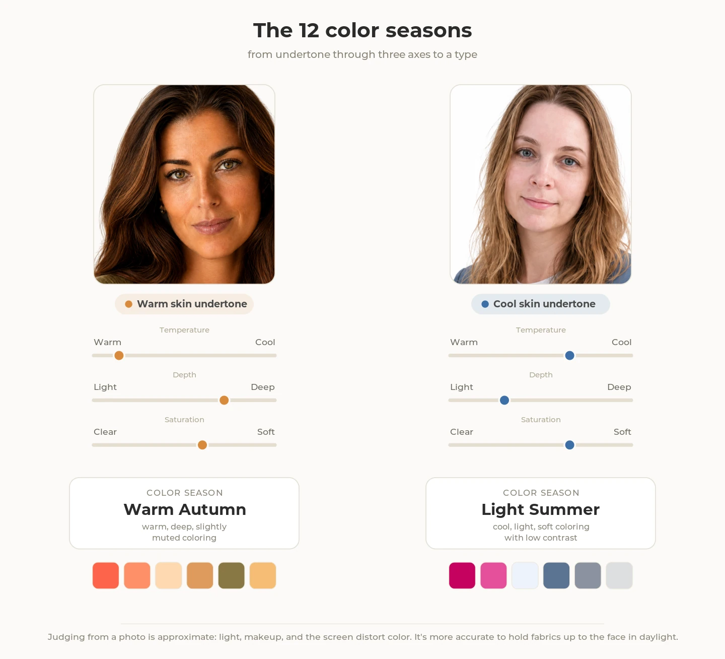
Your color season is a broad description of your natural coloring. To assess it, people usually look at three main characteristics. Picture them as three scales:
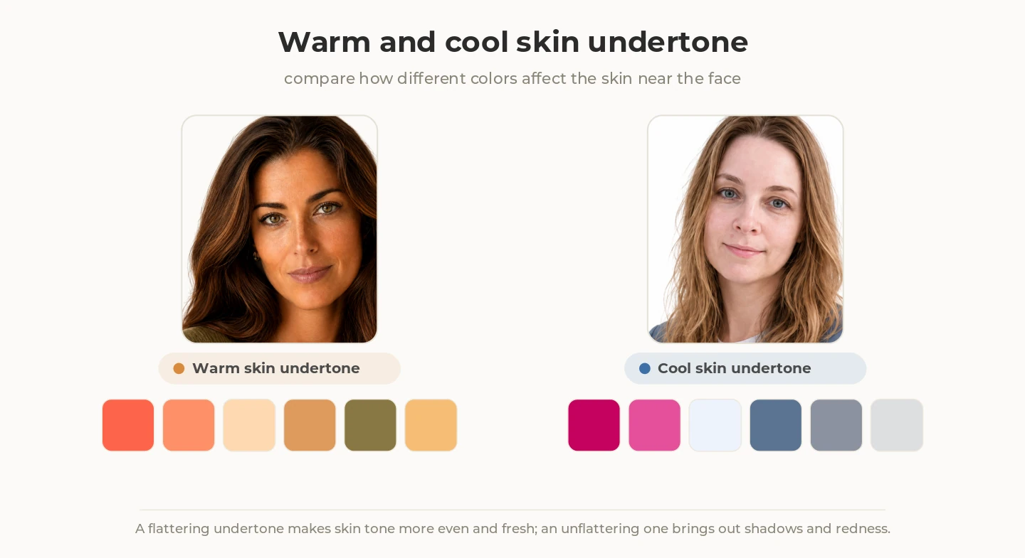
- Temperature: from warm to cool. It shows which undertone dominates your appearance: golden or peachy (a warm undertone), or pinkish or bluish (a cool undertone).
- Depth: from light to dark. Here you look at the overall impression of your skin, hair, and eyes: your coloring can be mostly light, mostly dark, or somewhere in between.
- Saturation: from clear and bright to soft and muted. For example, bright blue eyes and rich chestnut hair look saturated in color, while gray-blue eyes and ash-blond hair look less saturated and more muted, with a slight gray cast.
The idea of matching colors to a person's natural coloring predates the modern beauty industry. In the 1920s, while teaching at the Bauhaus, Swiss painter and educator Johannes Itten explored the relationship between a person's coloring and the colors that suited them, using the seasons as a metaphor. The idea was later developed by others and reached a mass audience with Carole Jackson's 1980 book Color Me Beautiful, which grouped people into four color seasons (history of the method). So it's better to treat your color season as a useful working hypothesis that makes choosing clothes simpler, not a lifelong diagnosis.
Note. Color temperature, lightness, and saturation are real properties of color that can be described and measured. But once they're applied to a person's appearance and used to group people into seasonal types, we're dealing with a styling model, not a scientific classification. Seasonal color types haven't been scientifically validated as natural categories, and even professional analysts often disagree about the same person (documented cases). That doesn't mean the whole idea is arbitrary: in a University of St Andrews experiment, about 75% of observers consistently matched cool blue tones to lighter skin and warm ones to tanned skin (study, 2021). This doesn't confirm that seasonal color types exist as natural categories, but it does show that skin tone really can affect how color is perceived near the face.
Systems and approaches to color analysis
The classic 4 seasons
The four-season system was one of the first color-typing frameworks to reach a mass audience. It follows a simple idea: natural coloring can be grouped into four broad families: Winter, Summer, Spring, and Autumn.
Each season has its own mix of temperature, depth, and saturation. You can also take contrast into account, meaning how noticeably your skin, hair, and eyes differ from one another.
- Winter: cool, deep, and clear; its palette leans toward clear, saturated colors. One possible example is dark hair with light skin. Cool and "icy" shades work well, along with jewel tones (emerald, sapphire, ruby) and pure white and black.
- Summer: cool, light, and muted. The overall coloring is soft and slightly muted; a possible example is a cool pinkish skin undertone with ashy hair. Signature shades include dusty rose, lavender, gray-blue, and muted raspberry.
- Spring: warm, light, and clear. Its palette has lots of warm, clear colors: peach, coral, warm ivory, golden yellow, fresh green. Golden or peachy tones are often noticeable in the overall coloring.
- Autumn: warm, deep, and muted. The overall coloring tends to be warm, soft, and deep. The palette is earthy and rich: terracotta, olive, mustard, burnt orange, dark teal.
The main limitation of the four-season system is that the categories are too broad: not everyone fits neatly into one of the four categories (history and critique of the system). That's why the seasonal system was later refined, splitting each color family into more specific types.
The 12 color seasons
The 12-season system is a more nuanced extension of the same four seasons, not a separate classification. Spring, Summer, Autumn, and Winter remain the foundation, but each family is divided into three subtypes. So instead of four broad palettes, you get twelve more specific ones.
It uses the same three characteristics: temperature, depth, and saturation. Within each season, one of them becomes especially prominent.
So Spring can be Light, Warm, or Bright; Summer can be Light, Cool, or Soft; Autumn can be Soft, Warm, or Deep; and Winter can be Deep, Cool, or Bright.
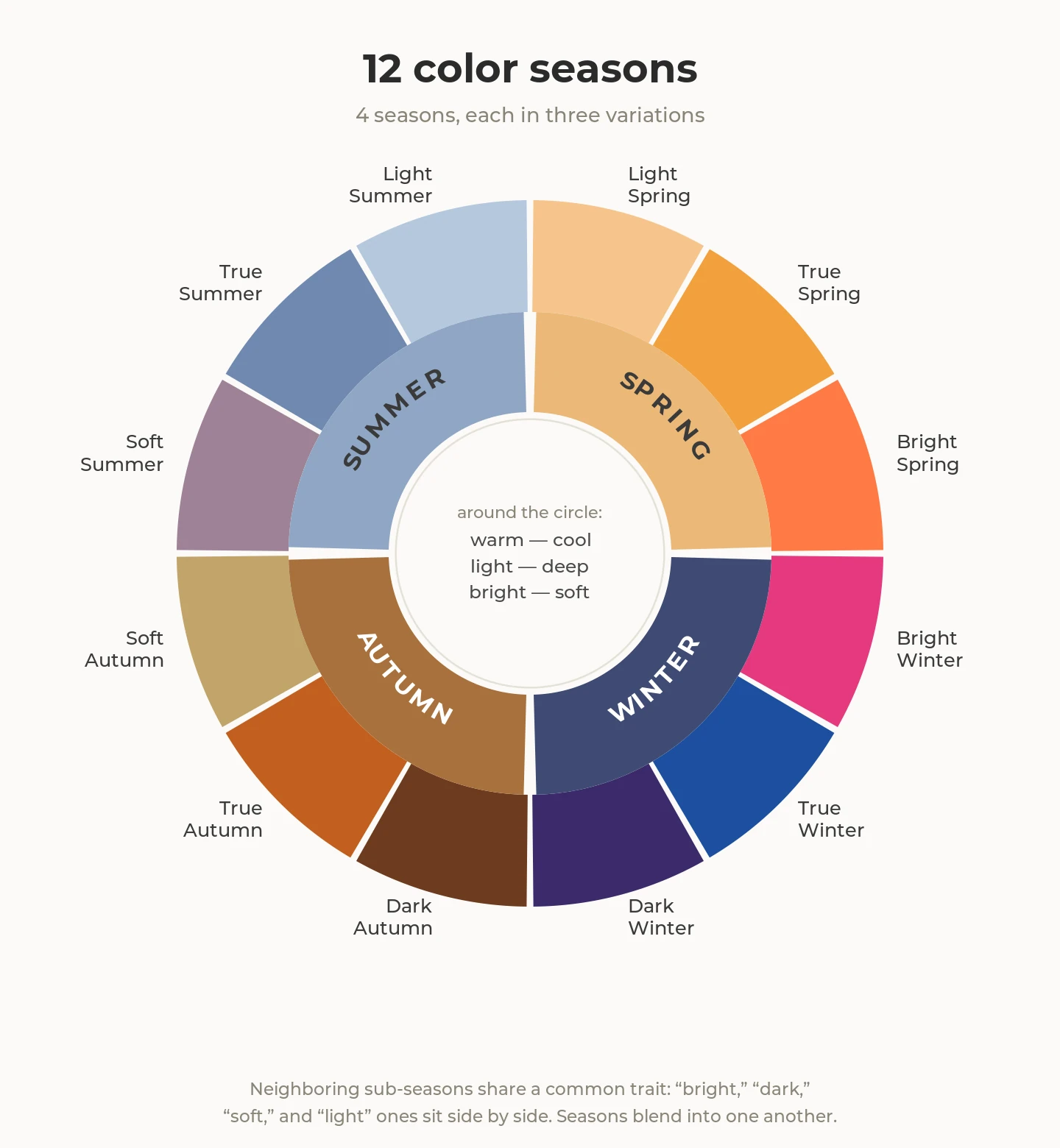
For example, all three Autumn types remain warm and muted, but they differ in emphasis. Soft Autumn leans toward more muted shades, Warm Autumn is the warmest of the three, and Deep Autumn emphasizes depth. These differences make it possible to narrow the palette beyond simply "Autumn."
The full grid looks like this:
- Spring (warm, light, clear): Light Spring: the lightest version, with light, warm, clear shades; Warm Spring: the warmest; Bright Spring: the brightest and clearest, closest to Winter.
- Summer (cool, light, muted): Light Summer: the lightest version, with soft cool shades; Cool Summer: the coolest; Soft Summer: the most muted and lowest in saturation, closest to Autumn.
- Autumn (warm, deep, muted): Soft Autumn: the most muted, closest to Summer; Warm Autumn: the warmest; Deep Autumn: the deepest, with dark, warm, saturated shades, closest to Winter.
- Winter (cool, deep, clear): Deep Winter: the deepest, closest to Autumn; Cool Winter: the coolest; Bright Winter: the clearest and brightest, closest to Spring.
Warm Spring, Cool Summer, Warm Autumn, and Cool Winter are also often called True Spring, True Summer, True Autumn, and True Winter.
Neighboring subtypes partly overlap in traits and shades (how the grid is built). So if you don't recognize yourself in one of the four classic seasons, the 12-type system helps narrow the search and find a palette closer to your specific coloring.
For a breakdown of all twelve palettes (neutral base, colors near the face, and combinations), see The 12 color seasons: palettes, colors and combinations.
The seasonal system isn't the only way to describe your natural coloring and choose a flattering palette.
The tonal approach
The tonal approach doesn't start with "are you a Spring or a Summer?" but with which trait of your appearance stands out most.
It works with the same three characteristics: temperature, depth, and saturation, but instead of a season it first identifies your leading trait. There are usually six dominant traits: Light, Deep, Warm, Cool, Clear, and Soft.
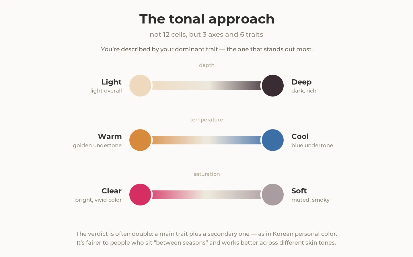
For example, your skin, hair, and eyes may create an overall very light coloring, while your appearance doesn't look clearly warm or cool. In seasonal analysis you'd then have to work out which season or subtype it's closest to. In the tonal approach you can start from the main trait (Light) and build the palette mainly around it.
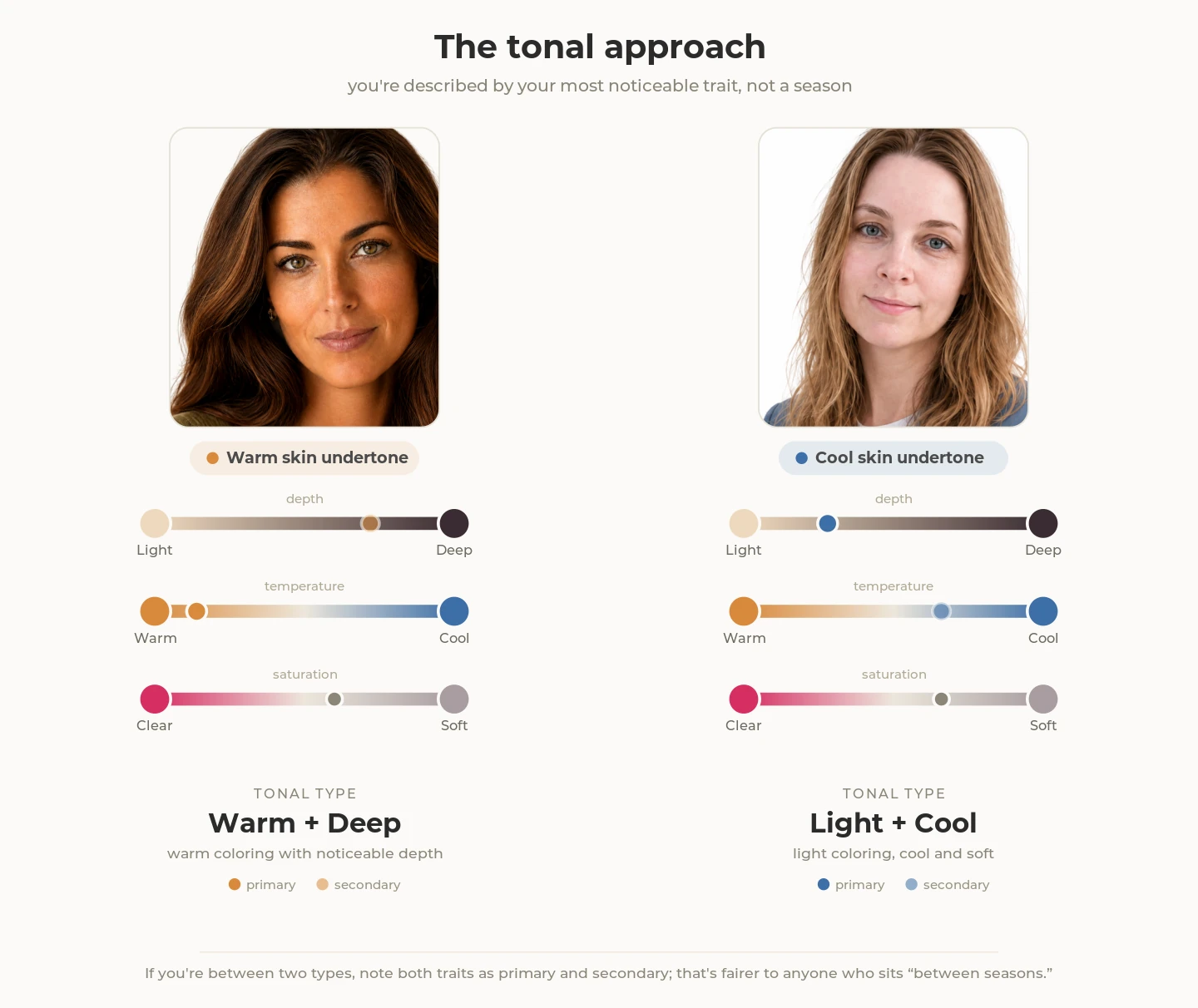
This approach is especially useful when one trait clearly dominates and the others are less pronounced.
Professional color analysis
Professional color analysis takes a more individual, hands-on approach. Rather than relying only on a season or dominant trait, a specialist compares specific shades directly against your face and uses the results to build a personalized palette.
During a consultation, the specialist usually uses draping: fabrics of different shades are held up to the face one by one and the results are compared. They look at which colors make your skin tone appear more even and your face look fresher, and which ones make redness, shadows, or unevenness more noticeable.
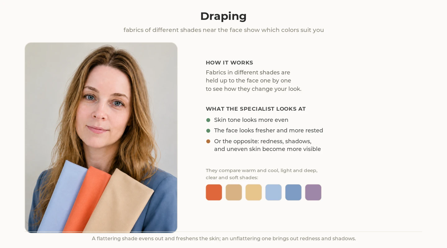
To interpret the results, they may use the 4-season system, the 12 color seasons, or a more detailed classification. In other words, professional color analysis doesn't replace these systems; it uses them as a framework for a more individualized result. In some cases the specialist may also suggest a neighboring palette or a second compatible type.
The result often comes with practical recommendations for clothing colors near the face, wardrobe neutrals, makeup, hair color, and jewelry.
In recent years, this kind of analysis has seen a new wave of popularity, driven largely by South Korea, where it's often called personal color. Through K-beauty, social media, and beauty tourism, this approach has become popular far beyond South Korea (on the personal color boom in Korea (TIME)). The method itself existed earlier and is used by specialists in various countries.
How to find your color season yourself: a checklist
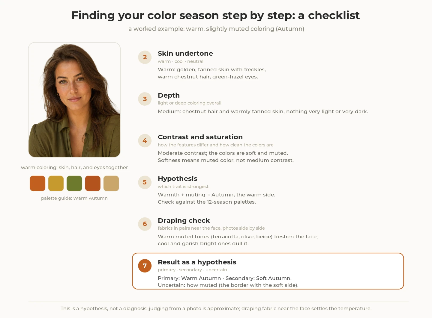
- Create the right conditions. Indirect daylight by a window, no makeup, hair pulled back (if it's dyed, cover it with a neutral scarf), a neutral background. Warm artificial light and bright colors near the face can noticeably distort how your skin tone reads.
-
Determine the temperature: warm, cool, or neutral undertone. Hold pairs of similar shades up to your face and focus on how your face looks next to each one, rather than which color you prefer: with a more flattering shade, your skin looks more even and shadows and redness are less visible.
- Gold or silver. Hold a gold and a silver piece of jewelry, or two fabrics in similar shades, up to your face. If gold is clearly more flattering, that may point to a warm undertone; if silver is, to a cool one. If there's no obvious difference, don't draw a conclusion from this test alone.
- Pure white or cream. Compare a pure, cool white with a warm cream or ivory near your face. If the pure white makes your face look fresher and more even while the cream makes your skin look more yellow or dull, that points to a cool undertone. If the cream makes your skin look more even while pure white brings out a gray cast or shadows under the eyes, that points to a warm undertone. If the difference is barely noticeable, your undertone may be closer to neutral.
- Coral or fuchsia. Compare two bright shades of roughly the same lightness and saturation near your face: a warm coral and a cool fuchsia. If coral makes your skin look more even, that points to a warm undertone; if fuchsia works better, that points to a cool one. Just make sure the fuchsia is genuinely cool rather than salmon-pink.
- An extra hint: the veins on your wrist. Bluish or purple veins are traditionally linked to a cool undertone, greenish ones to a warm one. But this test is unreliable, especially on medium and dark skin, so don't use it as your main criterion (a look at the test's limits). Don't draw a conclusion from a single test: look for the same pattern repeating across several comparisons.
-
Assess depth. Look at your skin, hair, and eyes together. If your overall coloring is mostly light and very dark colors create too much contrast near your face, you likely fall toward the lighter end of the scale. If deeper shades look better while very light ones make your face look paler, you likely fall toward the deeper end.
- Assess saturation. Compare similar colors of different saturation near your face: for example, a clear blue and a gray-blue, a bright pink and a dusty rose. If your face looks better next to clear, saturated colors, you fall closer to the clear end of the scale; if they pull focus and muted shades make your skin look more even, you fall closer to the soft end.
- Assess contrast as an additional clue. Look at how strongly your skin, hair, and eyes differ in depth. This is a supporting clue, not a fourth core characteristic.
- Check the result with draping. Compare fabrics in pairs: warm and cool, light and deep, clear and muted. Photograph them under identical conditions and compare the shots side by side rather than relying on memory.
- Form a working hypothesis. See which characteristics repeat across most of your comparisons. For example, cool and muted coloring often points toward the Summer family, while warm and deep coloring often points toward the Autumn family. Don't assign yourself a type based on just two traits: compare your result with the 12-season palettes.
If you want to check your hypothesis with a photo, take the shot in daylight without filters, and keep the limits in mind: a smartphone's automatic white balance can distort tones before the analysis even begins, so any result from a single selfie is worth double-checking (why the camera gets it wrong).
Common mistakes
- Testing your season under artificial light. Warm or cool lighting changes how your skin tone reads and can lead to a mistake. Compare colors in natural daylight, without bright sun or colored reflections.
- Using dyed hair as a guide. Color analysis is based primarily on your natural coloring, while dyed hair can significantly change how your overall coloring reads. For example, warm blonde hair or a very dark shade can make your coloring appear warmer, deeper, or higher in contrast. When analyzing your season, use your natural hair color as a reference, or the color at your roots if it's visible.
- Trusting a single test. No single sign gives a reliable answer on its own. This is especially true of the vein color test: it's affected by lighting, skin thickness, and individual differences. It's better to look at several clues together: your skin undertone, depth, and saturation, and then check your conclusion against real fabrics near your face.
- Treating a test or app result as definitive. Services promise "94–97% accuracy," but an independent check of 23 popular tools found they matched a professional assessment in only 26% of cases (the Created Colorful test). Treat any automated result as a starting point.
- Treating your palette as fixed forever. Your appearance changes: gray hair appears, hair can become lighter or darker, and skin can look different after a tan. That doesn't necessarily mean your season has fully changed, but it's worth rechecking your working palette from time to time.
- Rushing to get rid of clothes in "wrong" colors. Your palette is a guide, not a reason to rebuild your whole wardrobe. What matters most is how a color works near the face; pieces in other shades can stay part of your wardrobe.
How to use your palette in your wardrobe
Knowing your color season is most useful when it makes everyday wardrobe decisions easier. You don't need to rebuild your wardrobe around the palette. Start by saving it as a reference, then test it against the clothes you already wear.
1. Save your palette
Once you've found your season, save its palette to your phone or bookmark the page with it. That way it's on hand while you go through your wardrobe and shop.
To make your palette practical, pick out:
- neutral shades that are good for building the base of your wardrobe;
- accent colors you especially like;
- shades that work well near the face.
Also save a few color combinations that work well together: that way the palette helps you not only pick individual pieces but also build outfits.
You don't have to love and wear every shade in the palette. Pick the ones that suit your style and lifestyle, and over time you'll end up with your own working palette.
If you use the 12-season system, it's worth looking at neighboring types too: their palettes often overlap and give you extra options.
2. Look at the colors already in your wardrobe
Start with what you already wear, not with new purchases. A digital wardrobe helps you see everything together: which colors come up most often, which match your palette, and which fall outside it.
Don't assume the colors outside your palette are mistakes. Some of them may be among your favorite, most-worn pieces.
3. Test the palette in real outfits
Color matters most near your face. Start with tops, shirts, jackets, dresses, and scarves: compare similar outfits in different shades and see which ones make your face look fresher and your skin look more even.
You can wear colors outside your palette too. If a shade isn't especially flattering near the face, try keeping it for pants, skirts, shoes, a bag, or other accessories, or pair it with a more flattering shade near your face.
4. Check what you actually wear
Theory is only a starting point. Look at your wear history: which items and colors do you come back to most often?
Sometimes it confirms the palette. Sometimes it turns out that a color the system considers "not yours" is one you wear constantly and feel great in.
That's a useful result too. When the theory and your own experience disagree, trust your own experience.
5. Use the palette before you shop
Before buying, ask yourself two questions:
- Does this color suit me?
- Will this item work with what I already own?
That turns the palette from a set of restrictions into a practical shopping filter. It helps you narrow down your options and avoid pieces that are difficult to work into your existing wardrobe.
Virtual Try-On helps you gauge the overall impression of an item in an outfit. But for precise shade comparison it's better to use real fabrics or photos under the same daylight conditions, since an AI image may not reproduce color perfectly.
6. If you want, build a capsule around your palette
A palette is especially handy for a capsule wardrobe. Choose a few neutral colors for the base and a few accent shades that go well together.
When most pieces share a cohesive color palette, they combine more easily, so you can build more outfits from fewer pieces.
You don't have to build a capsule only from your season's colors. What matters more is that the shades you choose appeal to you, work together, and actually get worn.
The main thing: the palette should work for you
It's better to treat your color season as a working hypothesis than as a set of rules. If the palette makes choosing easier and helps you put together outfits you like, use it. If some of the recommendations don't match your style or real life, you can simply set them aside.
FAQ
What if I'm between two seasons?
That's normal. In the 12-season system especially, neighboring types can share a lot of shades. Compare both palettes and keep the colors that work better near the face and combine more easily with your wardrobe. You don't have to pick one type "forever."
Can my color season change over time?
Your natural undertone is generally considered fairly stable, but your overall coloring can change over time: your hair may turn gray or become lighter or darker, your skin may tan, and your overall contrast can shift. So rather than focusing on the label itself, revisit your working palette from time to time and check which shades still work best.
Do I need a professional color analysis?
Not necessarily. At-home color analysis can help you form a working hypothesis and build a palette to test. A professional analysis can be useful if your at-home tests keep giving conflicting results or you're having trouble choosing between a few closely related seasons.
Need help?
Contact us at support@getwardrobe.com