The 12 color seasons: palettes, colors and combinations
Why does dusty blue look especially good on one person, warm terracotta on another, while someone else comes alive in crisp black and white? The 12-season system helps you understand which shades work best with your coloring and how similar palettes differ from one another.
Each of the four seasons (Spring, Summer, Autumn and Winter) is divided into three types. That gives us twelve palettes, each with a different balance of temperature, lightness and saturation.
We'll look at each palette in practical terms: which colors belong to it, which neutrals work well as a wardrobe base, what to wear near your face, how to combine colors, and which neighboring seasons to compare if you're not sure where you fit.
A palette should not become a list of colors you can and cannot wear. Use it as a guide: choose the shades you actually like, try them in your outfits, and gradually build a palette that works for you.
If you do not know your season yet, start with How to find your color season and choose your palette. It explains temperature, lightness and saturation and shows how to check the result with draping.
Spring
Spring palettes are warm, ranging from light and moderately saturated to bright and high-contrast. Light Spring centers on light warm shades, Warm Spring on richer golden shades, and Bright Spring on the brightest, highest-contrast colors.
Light Spring
Typical features
Light Spring is usually characterized by light coloring and low to medium contrast between the skin, hair and eyes. Individual features can vary:
- Eyes: light, such as blue, green or light hazel, sometimes with golden flecks.
- Skin: light or medium-light, with a warm or neutral-warm undertone, often golden or peachy; freckles are possible, especially golden or light brown ones.
- Hair: light or medium-light, such as golden blond, strawberry blond, light copper or golden brown, without noticeable ash.
- Contrast: low to medium, with skin, hair and eyes close in lightness.
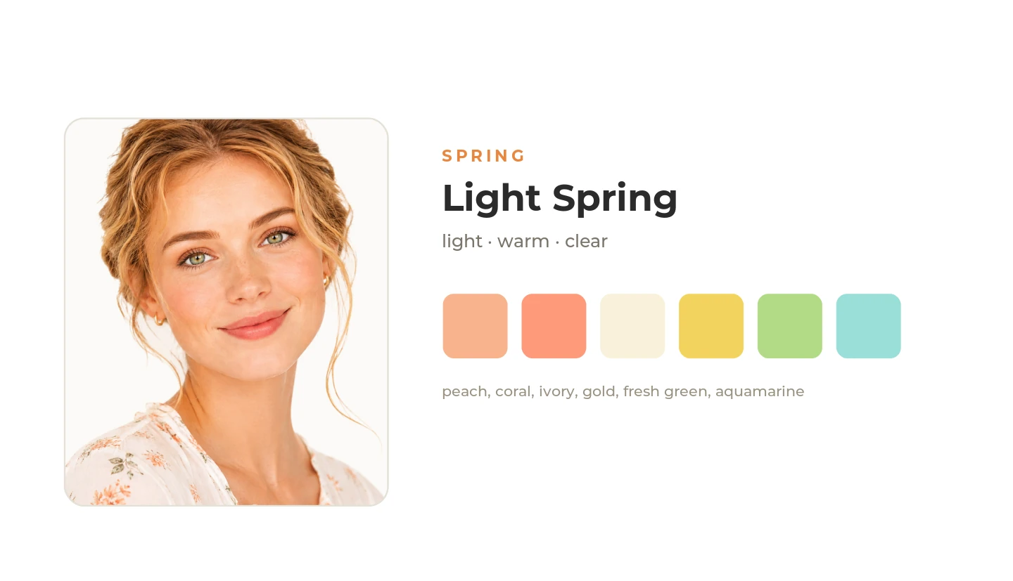
Palette formula: light + warm
Light Spring is the lightest Spring subtype. The palette is dominated by light, warm shades of moderate saturation. Compared with Warm Spring, the palette is lighter and less golden; compared with Light Summer, it is warmer and slightly less muted.
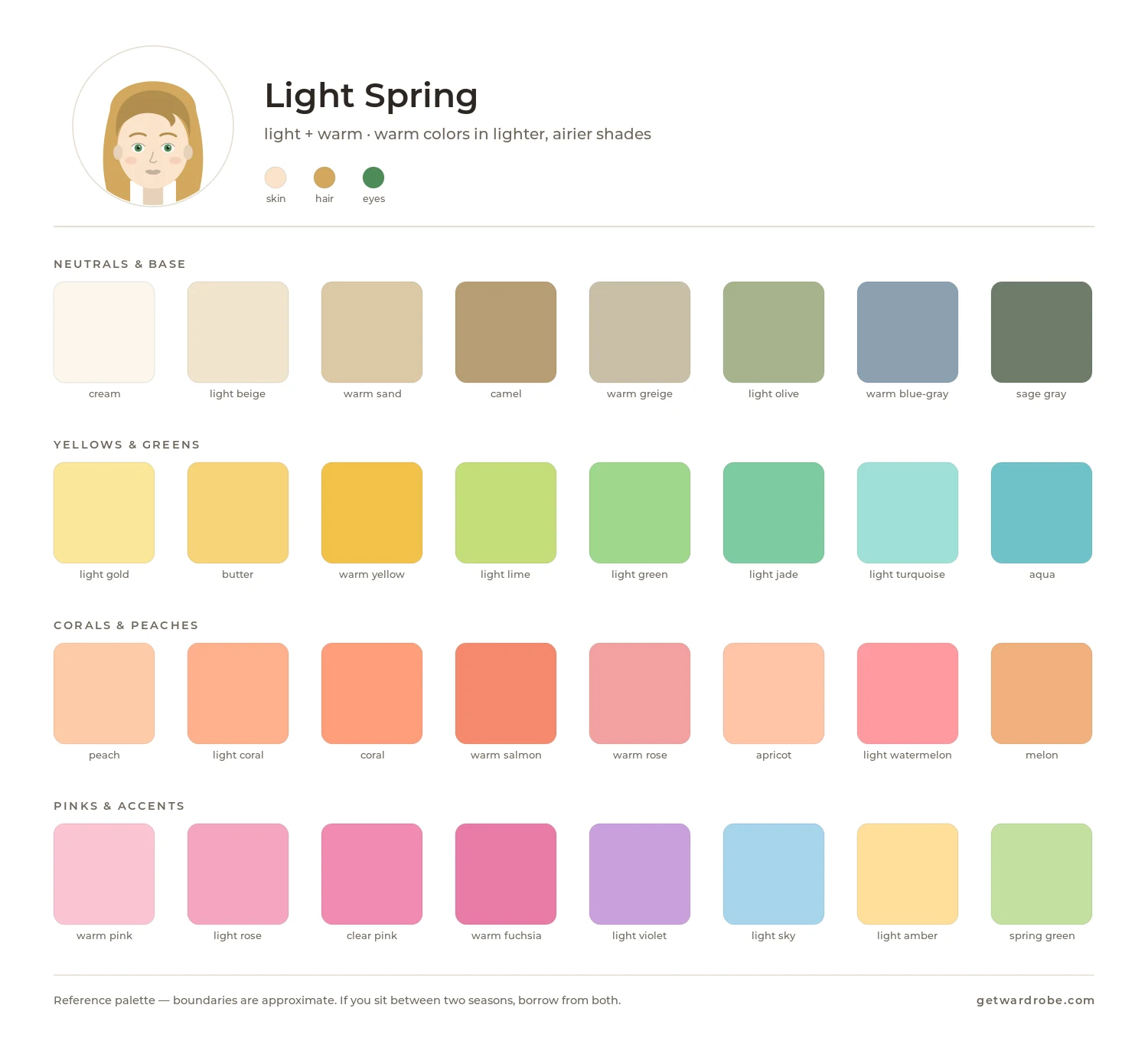
Palette
Signature shades include light peach, warm coral, apricot, soft yellow, light warm green, aquamarine and creamy pink.
Neutral base
Good wardrobe foundations include:
- warm ivory and cream;
- light beige and sand;
- warm light gray;
- soft camel;
- light denim.
What about black?
Black is often treated as a universal wardrobe neutral, but in seasonal color analysis it works differently across palettes. If your coloring is light, soft or warm, deep black near the face can create too much contrast or emphasize shadows.
This does not mean you need to give up black. Keep it for pants, skirts, shoes and accessories, or pair it with a shade that works better near your face. In Winter palettes, black is often part of the neutral base. Either way, check how it looks on you.
Colors near the face
For pieces near the face, try light peach, warm coral, aquamarine and creamy pink. These shades do not create too much contrast and can make the skin tone look more even and fresh. Similar seasons are easiest to compare with colors held near the face: look at which shades make shadows, redness and unevenness in the skin less visible.
How to combine
- a light base plus one slightly brighter warm accent;
- related colors, such as peach with coral, or aquamarine with soft yellow;
- several light shades in one outfit instead of a sharp light-to-dark contrast.
Use with care
Test very dark, cool and very muted shades near your face. If they create too much contrast or make the face look more tired, wear them away from your face, or add one of your lighter shades near the face.
What to compare it with
Warm Spring is warmer and more saturated. If light shades look washed out on you, compare both palettes near the face.
Light Summer is similar in lightness but cooler and softer. If cooler shades of the same lightness look better near your face than warm ones, check Light Summer.
Warm Spring
Typical features
Warm Spring is characterized primarily by warm coloring, with medium contrast between the skin, hair and eyes. Individual features can vary:
- Eyes: warm green, turquoise, topaz or warm hazel.
- Skin: warm or neutral-warm undertone, with golden, peachy or golden-beige tones; freckles are possible.
- Hair: golden blond, warm light brown, or light to medium chestnut with golden or honey highlights.
- Contrast: medium.
Palette formula: warm + clear
Warm Spring is the warmest Spring subtype. The palette is dominated by warm colors without a noticeable gray cast. Compared with Light Spring, the palette is more saturated and golden; compared with Bright Spring, it is less contrasting.
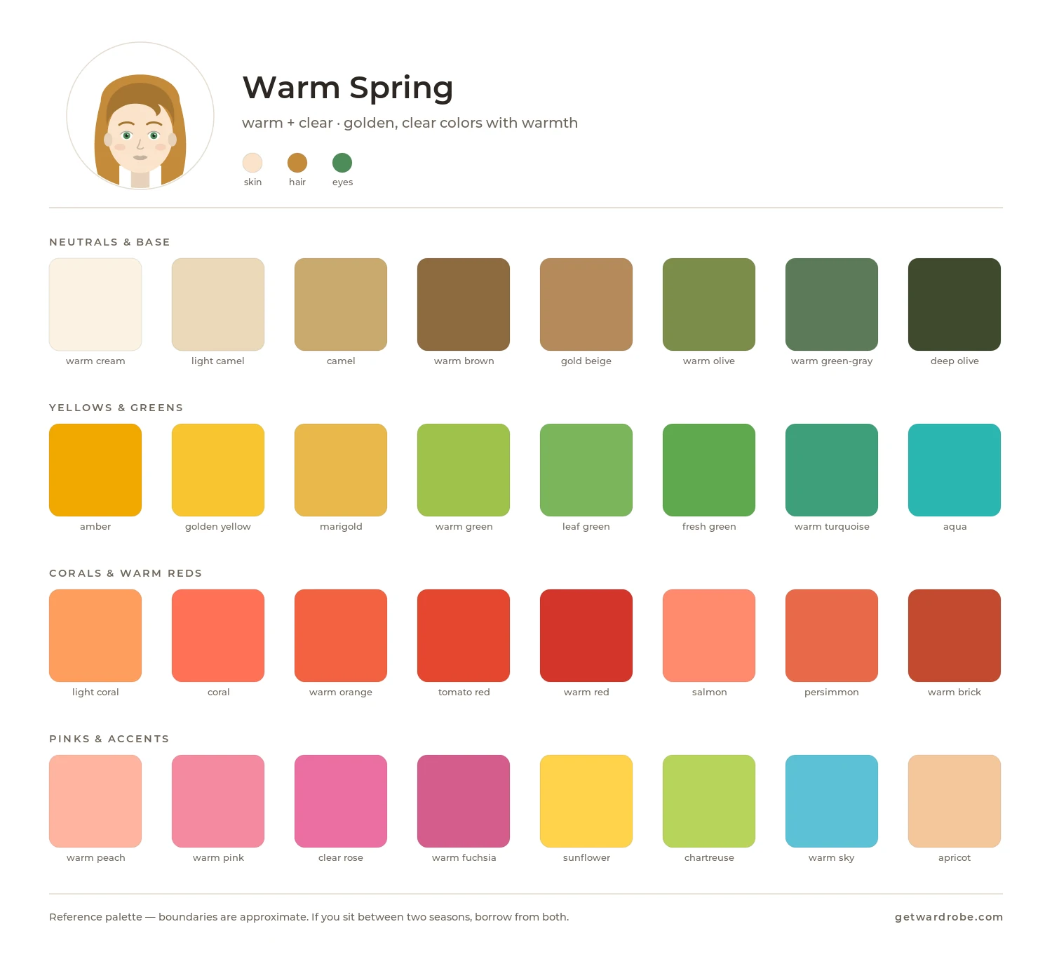
Palette
Signature shades include warm coral, golden yellow, warm turquoise, orange-red, grass green and warm beige.
Neutral base
Good wardrobe foundations include:
- warm ivory and cream;
- camel and caramel;
- warm brown;
- olive beige;
- warm denim.
Colors near the face
For pieces near the face, try warm coral, golden yellow and warm turquoise. The right warm shade makes the skin look fresher and more even, while a color that is too cool or grayish can make it look duller and emphasize shadows, redness or unevenness in the skin.
How to combine
- a warm neutral plus a saturated golden or coral accent;
- related warm colors, such as coral with golden yellow, or turquoise with grass green;
- medium contrast, without a sharp jump between light and dark shades.
Use with care
Test cool, very muted and dark shades near your face. If they make the skin look duller or grayer, wear them away from your face.
What to compare it with
Light Spring is lighter and less golden. If lighter shades look better on you, compare the two palettes.
Bright Spring is noticeably brighter and has more contrast. If saturated colors look better near your face than softer ones, check Bright Spring.
Warm Autumn is also warm, but its colors are darker and earthier. If spring colors look too bright near your face, compare Warm Spring and Warm Autumn.
Bright Spring
Typical features
Bright Spring usually has noticeable contrast between the skin, hair and eyes. Individual features can vary:
- Eyes: blue, green, turquoise or topaz, sometimes with a noticeable contrast between the iris and the white of the eye.
- Skin: warm or neutral-warm undertone.
- Hair: from light brown and chestnut to dark chestnut, with a warm or neutral cast.
- Contrast: medium to high, with features standing out distinctly from one another.
Palette formula: bright + warm
Bright Spring is the brightest Spring subtype. The palette is dominated by saturated warm colors without a strong gray cast. Compared with Warm Spring, the palette is brighter and has more contrast; compared with Bright Winter, it is warmer.
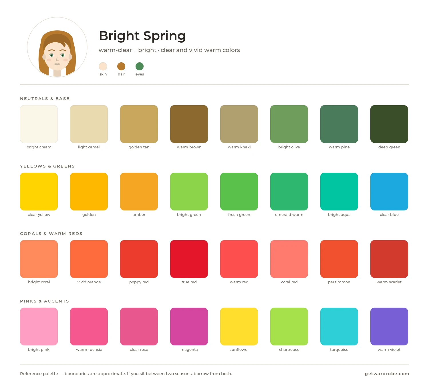
Palette
Signature shades include bright coral, bright warm pink, clear turquoise, bright green, sunny yellow, warm red and saturated blue-green.
Neutral base
Good wardrobe foundations include:
- warm white;
- light and medium warm gray;
- navy with a warm cast;
- warm brown;
- bright denim.
Colors near the face
For pieces near the face, try bright coral, clear turquoise, bright green and warm red. Saturated shades make the features more expressive and the skin look fresher, while strongly muted versions of the same colors look dull next to the face and make the features less expressive.
How to combine
Bright Spring handles more visible contrast than the other spring types:
- a neutral base plus a bright warm accent;
- contrasting pairs of bright shades, such as turquoise with coral, or green with warm red;
- two saturated colors in one outfit.
Use with care
Test dusty, very muted and dark earthy shades near your face. If they look dull, use them for pants, skirts, shoes or accessories.
What to compare it with
Warm Spring is less bright and contrasting. If saturated shades start to draw attention away from your face, compare the two palettes.
Bright Winter is just as bright but cooler. If cool saturated shades look better near your face than warm ones, check Bright Winter.
Summer
Summer palettes are cool and usually avoid sharp contrast between light and dark shades. Light Summer centers on lighter cool shades, Cool Summer on more distinctly cool colors, and Soft Summer on more muted shades.
Light Summer
Typical features
Light Summer is usually characterized by light, cool coloring and low to medium contrast between the skin, hair and eyes. Individual features can vary:
- Eyes: blue, gray-blue or gray-green.
- Skin: light or medium, with a cool, pinkish or neutral-cool undertone.
- Hair: light blond, ash blond, light brown or light chestnut, without a pronounced golden cast.
- Contrast: low to medium, with skin, hair and eyes close in lightness.
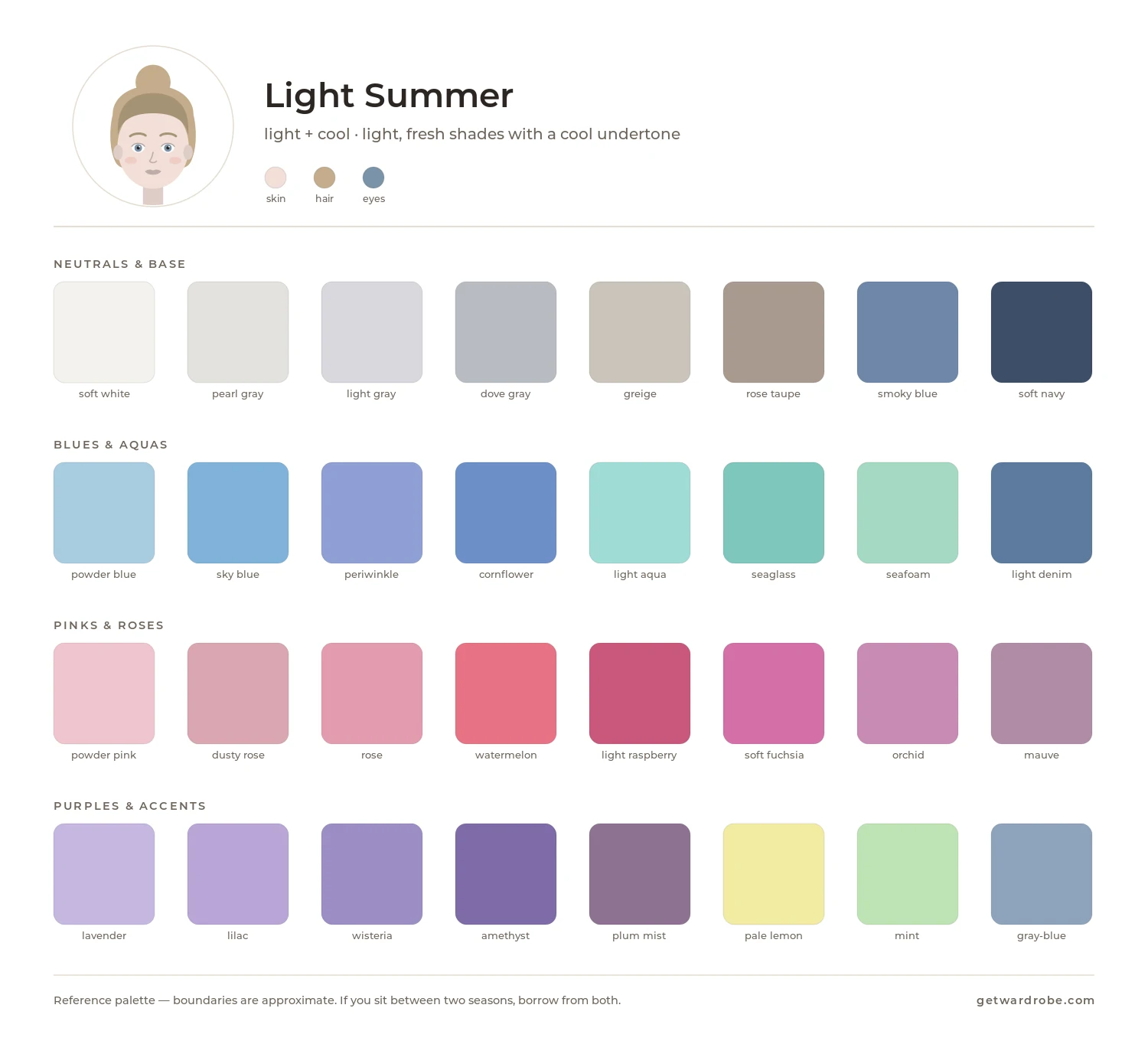
Palette formula: light + cool
Light Summer is the lightest Summer subtype. The palette is dominated by light, cool shades of moderate saturation. Compared with Cool Summer, the palette is lighter and slightly less cool; compared with Light Spring, it is cooler and softer.
Palette
Signature shades include powder blue, light lavender, cool pink, berry pink, soft blue-green, light gray-blue and cool mint.
Neutral base
Good wardrobe foundations include:
- soft cool white;
- light cool gray;
- cool taupe;
- gray-blue;
- light cool denim.
Colors near the face
For pieces near the face, try powder blue, cool pink, light lavender and soft blue-green. The right light, cool shade makes the skin look fresher and more even, while a dark shade can create too much contrast, and a shade that is too warm can make the skin look more yellow or red and emphasize unevenness.
How to combine
- several light cool colors in one outfit;
- a light cool base plus a more noticeable cool accent;
- related colors, such as blue with lavender, or pink with mint.
Use with care
Test dark, saturated and clearly warm shades near your face. If they create too much contrast or emphasize unevenness in the skin, wear them away from your face.
What to compare it with
Cool Summer is deeper and cooler. If your face looks paler in light shades, compare the two palettes.
Light Spring is similar in lightness but warmer. If warm shades of the same lightness look better near your face than cool ones, check Light Spring.
Cool Summer
Typical features
Cool Summer usually has predominantly cool coloring, with low to medium contrast. Individual features can vary:
- Eyes: blue, gray-blue, gray-green or cool hazel.
- Skin: cool or neutral-cool undertone, sometimes pinkish.
- Hair: ash brown or chestnut, without noticeable golden or reddish tones.
- Contrast: low to medium.
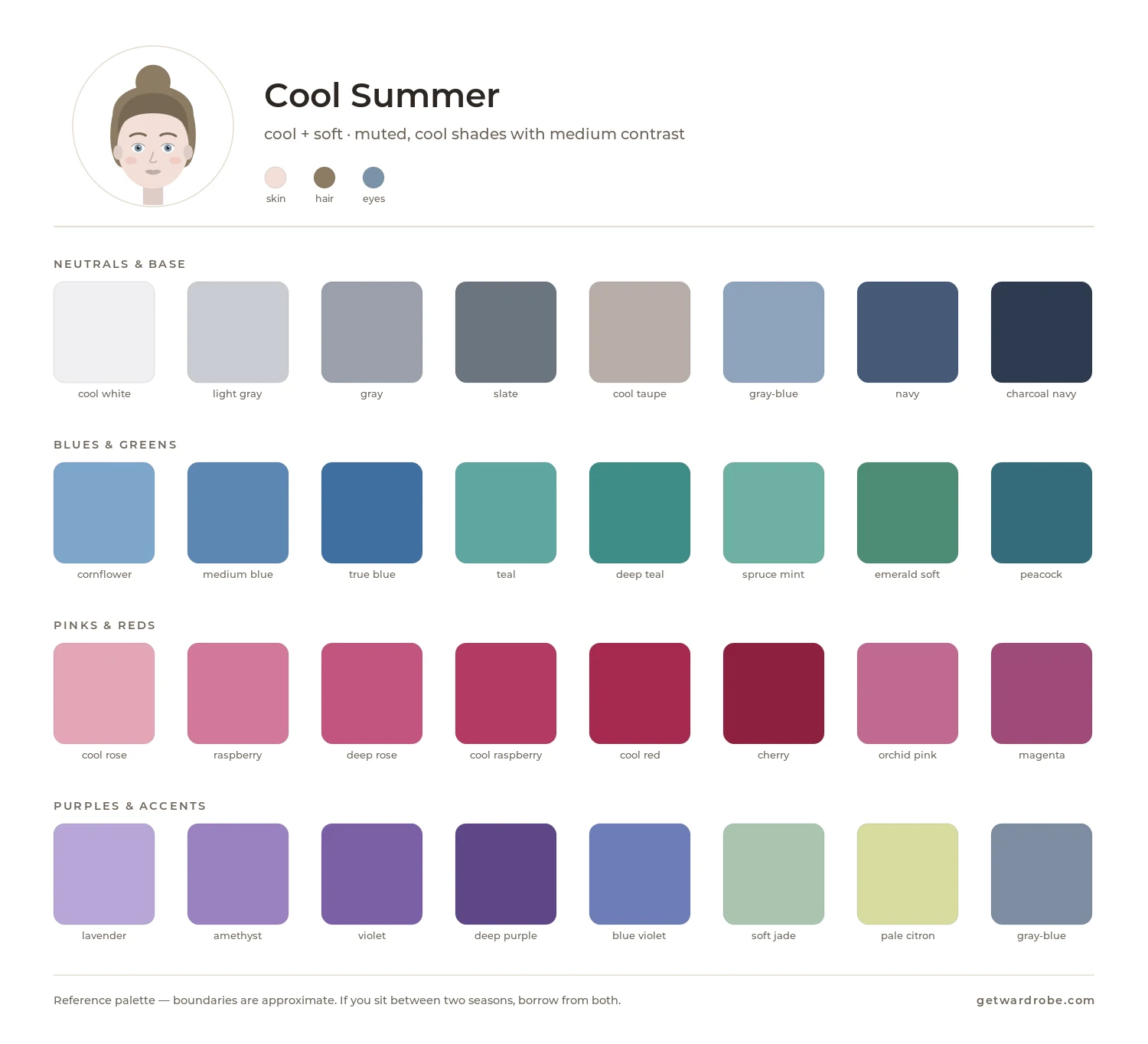
Palette formula: cool + soft
Cool Summer is the coolest Summer subtype. The palette is dominated by cool shades of moderate saturation. Compared with Light Summer, the palette is deeper; compared with Soft Summer, it is cooler.
Palette
Signature shades include cool pink, berry, lavender, dusty blue, gray-blue, cool turquoise and soft violet.
Neutral base
Good wardrobe foundations include:
- cool grays;
- graphite;
- cool taupe;
- navy;
- soft cool white.
Cool blue denim also works well, especially in medium and slightly faded shades.
Colors near the face
For pieces near the face, try cool pink, muted raspberry, lavender, powder blue, cool sea green and soft blue-violet shades. The right shade makes the skin tone look more even, while a color that is too warm can make yellow or red tones in the skin more noticeable, and a very bright one can draw attention away from the face.
How to combine
- monochrome combinations, such as several shades of blue or gray;
- related colors, such as blue with lavender, pink with berry, or gray-blue with cool green;
- a neutral base plus one more saturated cool shade.
Use with care
Test orange, warm peach, golden-brown and neon shades near your face. If they make the skin look more yellow or draw attention away from the face, wear them away from your face.
What to compare it with
Light Summer is lighter. If deeper colors create too much contrast near your face, check Light Summer.
Soft Summer is more muted and neutral. If grayish shades look better near your face than clearly cool ones, check Soft Summer.
Cool Winter is also cool but noticeably brighter, deeper and more contrasting. If summer shades look too pale near your face, compare Cool Summer and Cool Winter.
Soft Summer
Typical features
Soft Summer usually has low contrast, and the skin, eyes and hair tend to look more muted than bright. Cool tones are usually more noticeable than warm ones. Individual features can vary:
- Eyes: gray-blue, gray-green or soft hazel, muted rather than bright.
- Skin: neutral, olive or neutral-cool undertone.
- Hair: light to medium ash-brown, without pronounced golden tones.
- Contrast: low, with skin, hair and eyes close to one another.
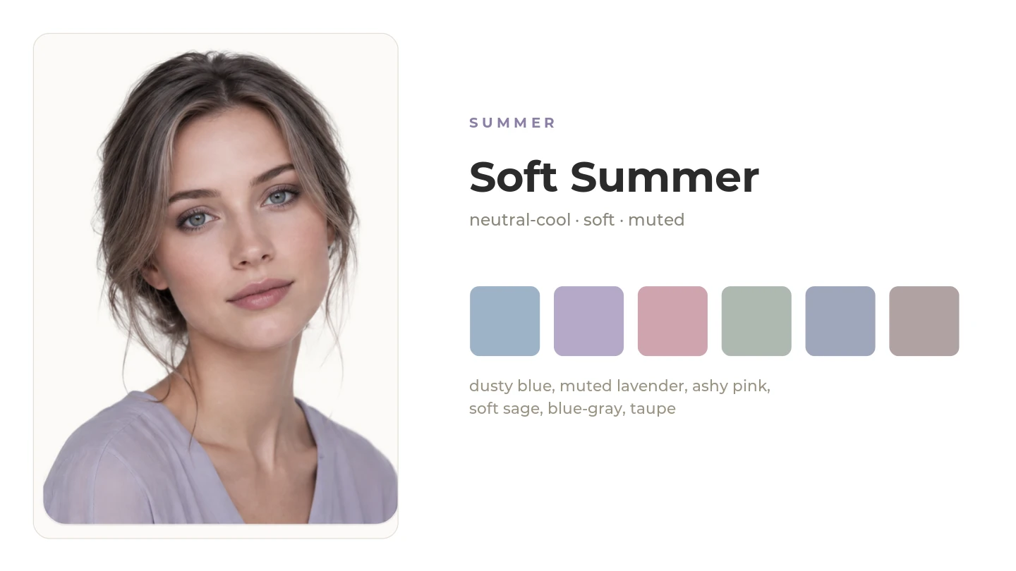
Palette formula: soft + cool
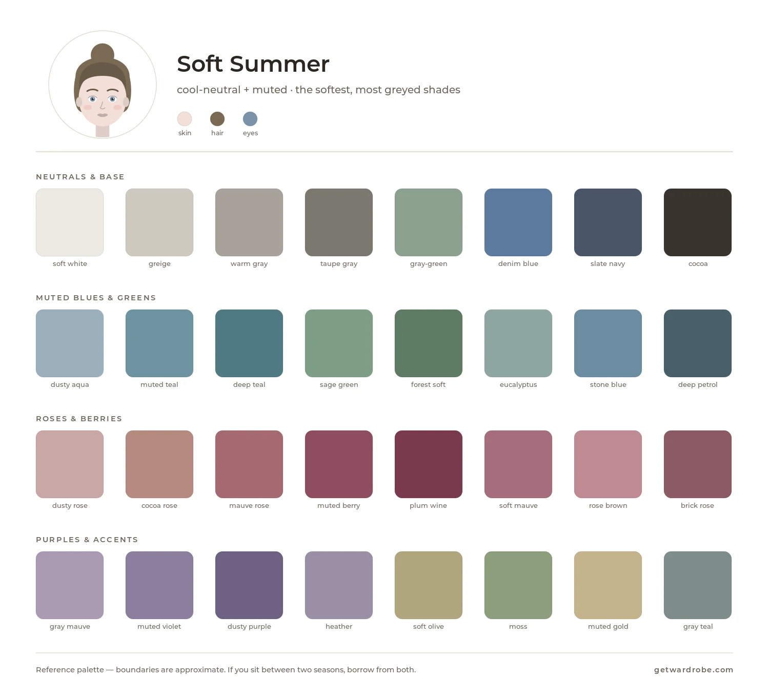
Soft Summer is the most muted Summer subtype. The palette is dominated by low-saturation shades with a slight gray cast. Compared with Cool Summer, the palette is less cool; compared with Soft Autumn, it is cooler.
Palette
Signature shades include smoky rose, muted blue-green, gray-lavender, dusty blue, soft plum and gray-green.
Neutral base
Good wardrobe foundations include:
- soft greige;
- cool taupe;
- gray-blue;
- smoky gray;
- muted denim.
Colors near the face
For pieces near the face, try smoky rose, muted blue-green, gray-lavender and soft plum. The right muted shade makes the skin tone look more even, while a very clear, bright color can create too much contrast and emphasize redness, shadows or unevenness in the skin.
How to combine
- a neutral plus one muted color accent;
- related dusty shades, such as rose with plum, or blue-green with gray-lavender;
- low contrast between colors.
Use with care
Test very bright, saturated colors, sharp black-and-white contrast, and warm golden-orange shades near your face. If they look too harsh or emphasize unevenness in the skin, wear them away from your face.
What to compare it with
Cool Summer is cooler and a little more saturated. If cooler shades look better near your face, compare with Cool Summer.
Soft Autumn is similar in softness but warmer. If warmer versions of these shades look better near your face than cooler ones, check Soft Autumn.
Autumn
Autumn palettes are warm and earthy, ranging from muted to deep and saturated. Soft Autumn centers on muted warm shades, Warm Autumn on richer golden colors, and Deep Autumn on the deepest, darkest shades.
Soft Autumn
Typical features
Soft Autumn usually has low contrast, and the skin, eyes and hair tend to look more muted than bright. Warm tones are usually more noticeable than cool ones. Individual features can vary:
- Eyes: warm hazel, muted green or warm gray.
- Skin: warm or neutral-warm undertone, beige, honey or olive; freckles are possible.
- Hair: golden blond, warm light brown, or light to medium chestnut, without strong contrast against the skin.
- Contrast: low to medium.
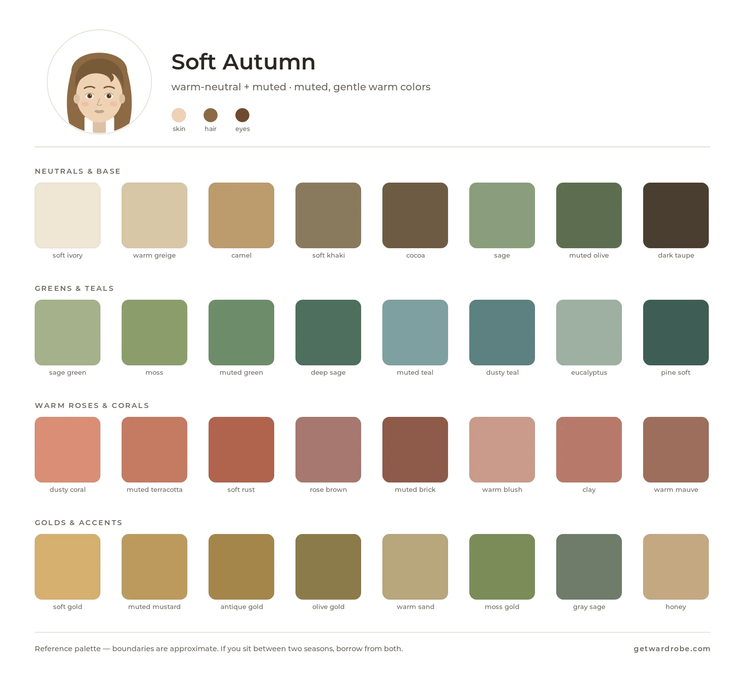
Palette formula: soft + warm
Soft Autumn is the most muted Autumn subtype. The palette is dominated by warm shades of low saturation. Compared with Warm Autumn, the palette is less saturated; compared with Soft Summer, it is warmer.
Palette
Signature shades include wheat, muted ochre, sage green, dusty terracotta, warm greige, muted teal-green and soft golden brown.
Neutral base
Good wardrobe foundations include:
- warm greige;
- wheat and sand;
- soft camel;
- warm gray-brown;
- muted warm denim.
Colors near the face
For pieces near the face, try sage green, dusty terracotta, muted ochre and soft golden brown. The right warm, muted shade makes the skin look more even, while a very bright or cool color can create too much contrast and emphasize redness, shadows or unevenness in the skin.
How to combine
- a warm neutral plus one muted warm accent;
- related earthy shades, such as terracotta with ochre, or sage with golden brown;
- low contrast between colors.
Use with care
Test very bright, cool and contrasting colors near your face. If they look too harsh or emphasize unevenness in the skin, wear them away from your face.
What to compare it with
Warm Autumn is more saturated and warmer. If muted shades look too pale near your face, compare the two palettes.
Soft Summer is similar in softness but cooler. If cooler versions of these shades look better near your face, check Soft Summer.
Warm Autumn
Typical features
Warm Autumn is characterized primarily by warm coloring, with medium contrast between the features. Individual features can vary:
- Eyes: warm green, olive, hazel, amber or golden brown.
- Skin: can range widely in depth, with a warm golden, peachy, bronze or olive undertone; freckles are possible.
- Hair: golden blond, chestnut, dark chestnut or auburn, often with copper or golden highlights.
- Contrast: medium.
Palette formula: warm + soft
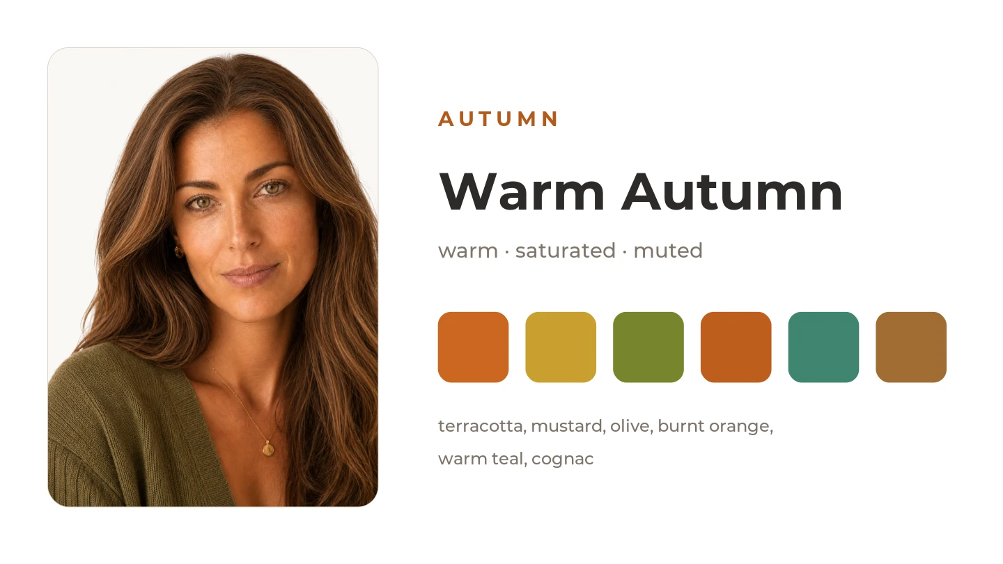
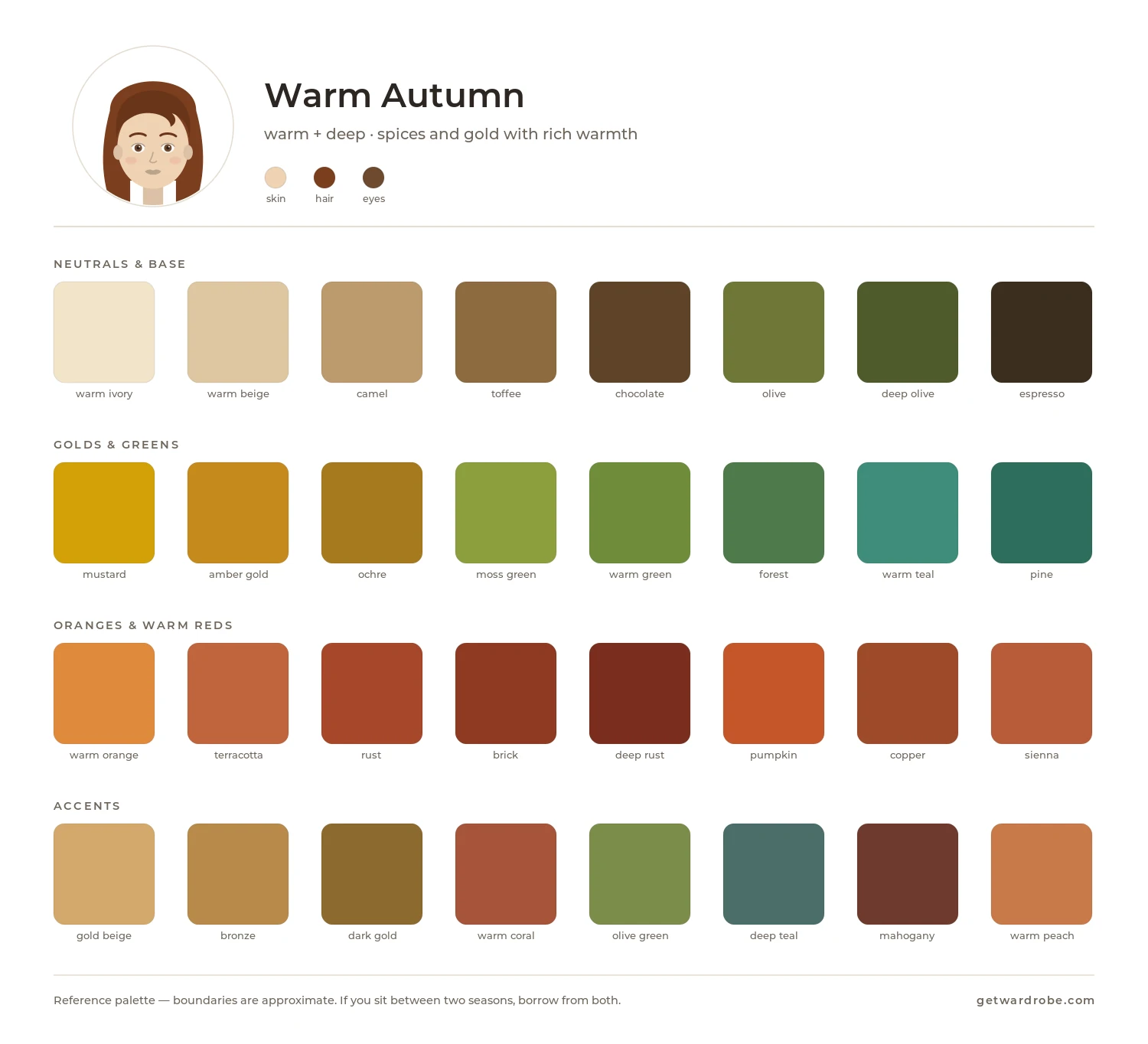
Warm Autumn is the warmest Autumn subtype. The palette is dominated by saturated warm colors. Compared with Soft Autumn, the palette is more saturated; compared with Deep Autumn, it is lighter.
Palette
Signature shades include terracotta, mustard, olive, burnt orange, pumpkin, dark teal and warm brown.
Neutral base
Good wardrobe foundations include:
- warm brown and chocolate;
- camel and caramel;
- olive beige;
- warm khaki;
- warm denim.
Colors near the face
For pieces near the face, try terracotta, mustard, dark teal and olive-green. The right warm, saturated shade makes the skin look fresher and more even, while a color that is too cool or grayish can make it look duller and emphasize unevenness in the skin.
How to combine
- a warm brown base plus a saturated warm accent;
- related shades, such as terracotta with mustard, or olive with pumpkin;
- medium contrast, without very cool shades.
Use with care
Test icy blue, cool pink, very muted and other distinctly cool shades near your face. If they make the skin look duller or grayer, wear them away from your face.
What to compare it with
Soft Autumn is more muted. If saturated colors look too bright near your face, compare the two palettes.
Deep Autumn is deeper and darker. If deeper warm shades look better near your face, check Deep Autumn.
Warm Spring is also warm, but its colors are lighter and brighter. If autumn colors look too dark near your face, compare Warm Autumn and Warm Spring.
Deep Autumn
Typical features
In Deep Autumn, the hair, eyes, or both are usually fairly dark, and contrast can range from medium to high. Individual features can vary:
- Eyes: brown, dark hazel or rich green.
- Skin: can range widely in depth, with a warm or neutral-warm golden, olive or bronze undertone.
- Hair: dark, such as chestnut, chocolate brown, warm dark brown or auburn.
- Contrast: medium to high.
Palette formula: deep + warm
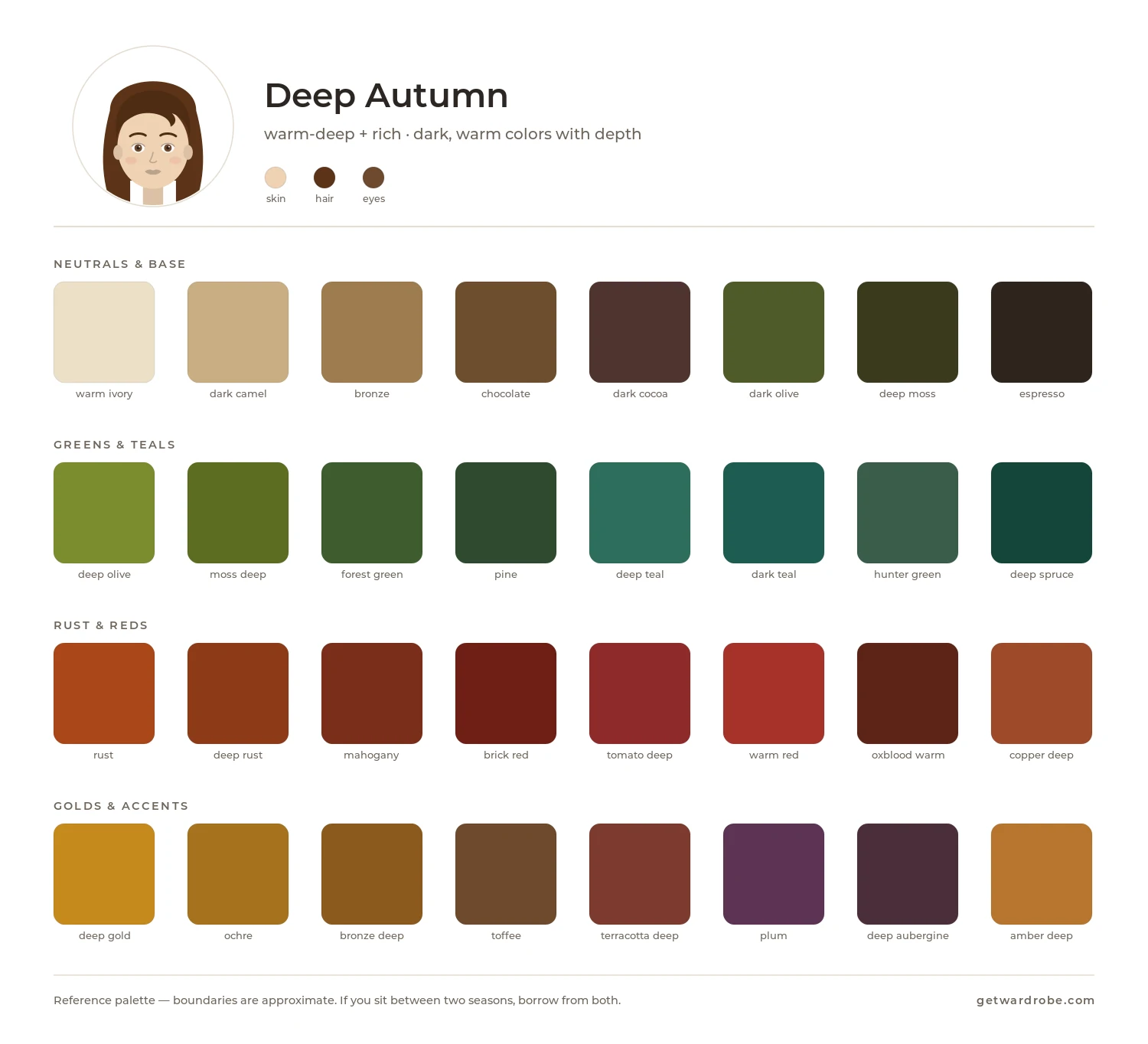
Deep Autumn is the deepest Autumn subtype. The palette is dominated by dark, saturated warm shades. Compared with Warm Autumn, the palette is deeper and darker; compared with Deep Winter, it is warmer.
Palette
Signature shades include dark terracotta, burgundy-brown, dark olive, burnt umber, forest green, dark gold and deep chestnut.
Neutral base
Good wardrobe foundations include:
- dark chocolate;
- dark khaki and olive;
- warm espresso brown;
- dark warm gray-brown;
- dark warm denim.
Colors near the face
For pieces near the face, try dark terracotta, forest green, dark gold and deep teal. The right deep, warm shade emphasizes the features and keeps the skin from looking dull, while a shade that is too light or cool can look too pale and create too much contrast.
How to combine
- a dark warm base plus a more saturated warm accent;
- contrasting pairs in the warm range, such as forest green with dark gold, or terracotta with chocolate;
- several deep warm shades in one outfit.
Use with care
Test light cool pastels and very muted shades near your face. If they look too pale next to your darker features, wear them away from your face.
What to compare it with
Warm Autumn is lighter. If the darkest shades create too much contrast near your face, compare the two palettes.
Deep Winter is similar in depth but cooler. If cool deep shades look better near your face than warm ones, check Deep Winter.
Winter
Winter palettes are cool and high-contrast, ranging from deep, dark shades to bright, saturated ones. Deep Winter centers on deep cool shades, Cool Winter on saturated medium-depth colors without noticeable warmth, and Bright Winter on the brightest, highest-contrast colors.
Deep Winter
Typical features
In Deep Winter, the hair, eyes, or both are usually dark, with medium to high contrast between the features. Individual features can vary:
- Eyes: dark brown, near-black, cool green, gray or blue.
- Skin: can range widely in depth, with a cool or neutral-cool undertone.
- Hair: dark chestnut, very dark brown or black, without a pronounced reddish cast.
- Contrast: medium to high, with darker and lighter features standing out noticeably.
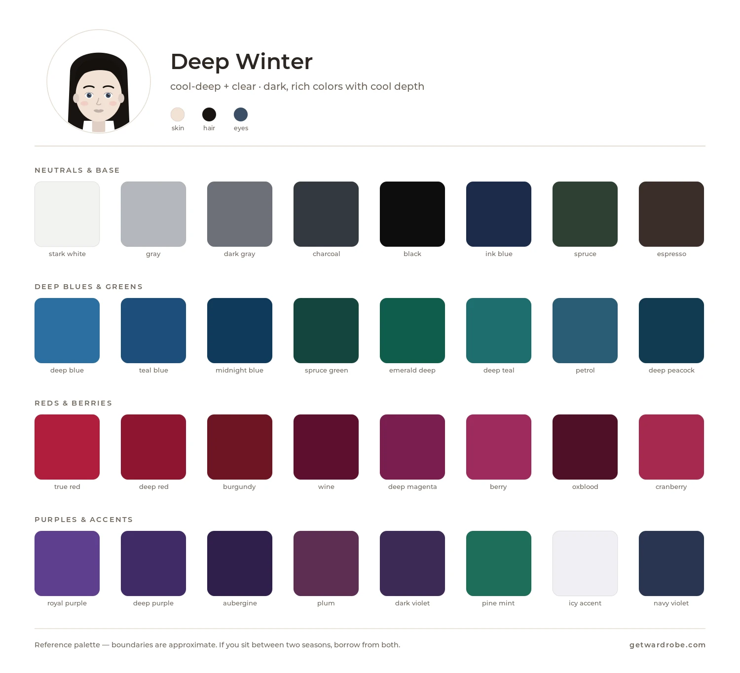
Palette formula: deep + cool
Deep Winter is the deepest Winter subtype. The palette is dominated by dark, saturated cool colors. Compared with Cool Winter, the palette is darker; compared with Deep Autumn, it is cooler.
Palette
Signature shades include dark burgundy, cool plum, emerald, sapphire blue, blackberry, dark teal and dark cool red.
Neutral base
Good wardrobe foundations include:
- black;
- navy;
- graphite and charcoal;
- cool dark gray;
- dark cool denim.
Black can also work near the face, especially if you naturally have high contrast between your features. If an all-black outfit looks too heavy, pair it with sapphire, emerald, plum or another color from your palette.
Colors near the face
For pieces near the face, try emerald, sapphire blue, cool plum and dark burgundy. The right deep, cool shade emphasizes the natural contrast of your features without making the face look harsher, while a shade that is too light or warm can make the face look duller and the features less expressive.
How to combine
- a dark cool base plus a saturated accent;
- contrasting pairs, such as black with emerald, or navy with blackberry;
- several deep cool colors in one outfit.
Use with care
Test very light warm pastels and very muted shades near your face. If they look too pale next to your darker features, wear them away from your face.
What to compare it with
Cool Winter is lighter and a little brighter. If the deepest shades create too much contrast near your face, compare the two palettes.
Deep Autumn is similar in depth but warmer. If warm deep shades look better near your face than cool ones, check Deep Autumn.
Cool Winter
Typical features
Cool Winter is usually characterized by cool coloring and medium to high contrast. Individual features can vary:
- Eyes: blue, gray-blue, cool hazel, dark brown or near-black.
- Skin: cool or neutral-cool undertone.
- Hair: chestnut to black, usually without golden or reddish tones.
- Contrast: medium to high, with features clearly separated from one another.
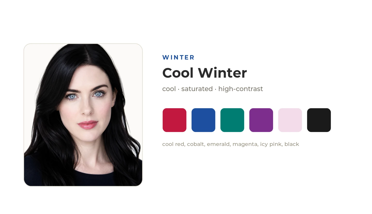
Palette formula: cool + clear
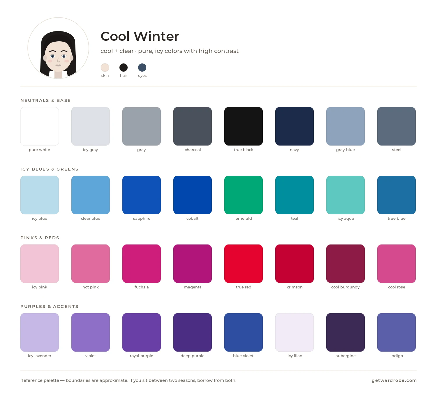
Cool Winter is the coolest Winter subtype. The palette is dominated by saturated cool colors without a gray cast. Compared with Deep Winter, the palette is slightly lighter and brighter; compared with Bright Winter, it is cooler.
Palette
Signature shades include clear, cool red, fuchsia, icy pink, royal blue, emerald, purple and bright turquoise.
Neutral base
Good wardrobe foundations include:
- black;
- pure white;
- navy;
- cool gray;
- cool dark denim.
Black and pure white work especially well together, including as a high-contrast pairing near the face.
Colors near the face
For pieces near the face, try clear, cool red, fuchsia, royal blue and emerald. The right cool, saturated shade emphasizes the contrast of your features, while muted or warm versions of the same colors can look dull near the face and make the skin look more yellow.
How to combine
- a cool base plus a bright cool accent;
- contrasting pairs, such as black with fuchsia, or white with royal blue;
- a noticeable contrast between light and dark colors.
Use with care
Test warm, earthy and very muted shades near your face. If they reduce the contrast of your features or make the skin look duller, wear them away from your face.
What to compare it with
Deep Winter is deeper and darker. If the darkest cool shades look better near your face, check Deep Winter.
Bright Winter is brighter and a little less cool. If the most saturated colors look better near your face, check Bright Winter.
Cool Summer is also cool but noticeably softer and lighter. If winter colors look too bright or contrasting near your face, compare Cool Winter and Cool Summer.
Bright Winter
Typical features
Bright Winter usually has high contrast and a noticeable difference between individual features. Individual features can vary:
- Eyes: blue, turquoise-blue, green, hazel, dark brown or near-black, often with a well-defined iris.
- Skin: can range in depth, with a neutral or neutral-cool undertone.
- Hair: from chestnut to very dark brown or black, with a cool or neutral cast.
- Contrast: usually high.
Palette formula: bright + cool
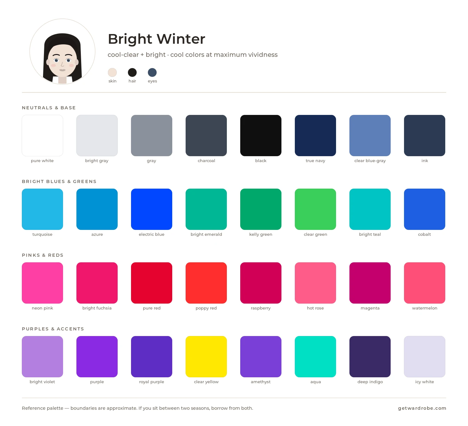
Bright Winter is the brightest Winter subtype. The palette is dominated by saturated cool colors without a noticeable gray cast. Compared with Cool Winter, the palette is brighter and slightly warmer; compared with Bright Spring, it is cooler.
Palette
Signature shades include bright fuchsia, clear red, electric blue, bright turquoise, emerald green, cool lime and icy pink.
Neutral base
Good wardrobe foundations include:
- black;
- pure white;
- cool gray;
- navy;
- bright cool denim.
Black and white work especially well together, creating the high contrast typical of this palette.
Colors near the face
For pieces near the face, try bright fuchsia, electric blue, emerald green and clear red. The right saturated, cool shade emphasizes the contrast of your features and makes them more expressive, while strongly muted versions can look dull near the face.
How to combine
- a black-and-white or other contrasting base plus a bright color;
- bright contrasting pairs, such as fuchsia with turquoise, or red with emerald;
- two saturated contrasting colors in one outfit.
Use with care
Test very muted, dusty and earthy shades near your face. If they look dull next to your bright features, wear them away from your face.
What to compare it with
Cool Winter is less bright and a little cooler. If the brightest colors start to draw attention away from your face, compare the two palettes.
Bright Spring is just as saturated but warmer. If warm bright colors look better near your face than cool ones, check Bright Spring.
How to apply the palette to your wardrobe
Once you know your season or have narrowed it down to a few similar palettes, open your wardrobe in GetWardrobe and look at:
- which colors already appear most often in your wardrobe;
- which of them match your season's palette;
- which shades you are actually missing;
- how these colors look in your saved outfits and in wear history;
- what to keep in mind for your next purchases.
For more on applying your color season to your wardrobe and what to do with pieces outside the palette, see How to find your color season and choose your palette.
Frequently asked questions
Do I need an exact match with the shade on the palette?
No. The card shows a direction: temperature, lightness and saturation. Real fabric does not have to match the digital sample exactly, especially since a screen can slightly distort color.
Can I use colors from a neighboring palette?
Yes, especially if you fall between two similar types. Start with shades that are similar in both palettes and test them near your face.
Need help?
Contact us: support@getwardrobe.com